Still Life Mood Board!

Still life images are images which do not use living things such as hum as and animals. Most still life images use things such as glasses, flowers, fruit, bowls etc. as you can see in the images above.
Jonathen Knowles is a still life photographer he is based in London, and specialises in graphic still life people and liquid photography. He is a top photographer and has been in the top 10 award winners in the Graphis Annuals.
 |
| Beauty Products |
 |
| White on White |
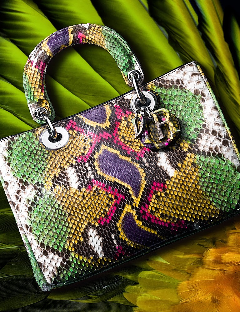 |
| Untamed Bags Objectively in this image you can see in this image the photographer has thought a lot about the detail and the design, you can see that the bag blends in with the background but the bag still stands out and is the first thing that meets the eye. He would of had to think a lot about the light also because as you can see in some places of the image the light is very bright and in others it is extremely dull. Knowles has centred the bag in the middle of the photograph and has made sure that there are no dull spaces in the image. Everywhere has colour so it is hard not to find it fascinating. Also the bag has a bit of symmetry to it so by this it draws your attention to the brighter colours of the bag in the centre of it. Subjectively, I think the image as a whole is extremely bright and colourful making the image eye catching, the whole of the photo is coloured and the photographer has thought deep into the background as well as the main object, which shows he doesn't just want people to look at the bag he also wants them to look at the background and what he has done with it. The background is very clear and and the dark shadow parts are very defined and bold. The pattern on the bag is also very defined and you can easily tell what the pattern is which means the photographer has got the lighting right on the bag and want people to be able to see the circular pattern. |
 |
| The Finer Details |
Gabriel Orozoco is a still life mexican photographer who was born on April 27th 1962. In 1986 Orozco moved to Madrid to go to Circulo de Bellas Artes, this is where he first discovered art and looked at many artists work. Which is what inspired him to take it up himself.
| Meso con arena (Sand on Table), 1992 |
 |
| ‘Black Kites’ (1997) Objectively as you can see in this image Orozoco has thought a lot about the skull and how to make it stand out. So what he has done this by putting the black background behind which makes the skull stand out even more. This is because there is no colour in the background which draws your attention to it. Then by the holes in the skulls nose and eyes this makes the picture even more interesting because its like the holes lead somewhere. Which then gets people thinking about the image and imagining all sorts of things to why the photographer has done this and has made it stand out so much. As soon as your eyes see the image you instantly look at it because of the black and white that he has used which is what has made the image more effective and is what makes the image more eye catching. Subjectively, I think the image is very bold and different, the black background makes the skull look like it is floating by itself in the middle of no where.  Harold de Puymorin is a still life photographer from Hong Kong.
Objectively as you can see in this image he has thought about the background which is a street an then his main feature which is the cloth. He hasn't really got much colour in this image he has just focused on his main object and placed it in an interesting way. By doing this the person who is looking at the image will look more in-depth to try and figure out what the photographer has tried to portray. You have to focus really deep into the image to see the outline of the fabric, but this is also what makes you want to look at the image even longer. Subjectively this image stands out because you don't really see things like this which is what makes it intriguing and different from other photographers. The photographer has obviously thought hard about what he wanted to capture in this image and he has put a lot of time and effort into getting it right and how he wanted it.

Here are a few of my own still life photographs most of my ideas came from the photographs that i have seen from the artists which i have written about, the main one which most of my inspiration came from was Jonathen Knowles. I have taken some images very similar to his because i think his work is wonderful. The things that i got from his work was the nail varnish and also the white on white i thought these where very effective and made his work stand out to me.
         |
Here is a still life photoshops which I have done I did it in the theme of Andy Warhol, I decided to use pastel colours because i think it makes the images stand out more and makes it look more subtle instead of bright and loud.


No comments:
Post a Comment